Asus Cube is the device that features latest Google TV OS that want to be part of your living room entertainment setup. With a good design, an unique remote, and $139 price tag, can it push Google TV further where others may have failed? Let’s find out.
Introduction
It seems like everyone wants to crack the entertainment center business, but so far, most competitors have not had much success. Microsoft has tried with the Windows Media Center but that did not work out so well and we have seen MS has since stopped prompting the Media Center Edition with Windows 8. Apple has had slightly better success with their AppleTV, largely thanks to its tightly integrated link to the iTunes store. Google is yet another player that is trying to grab a slice of the pie with Google TV.
Google is determined to make the Google TV a success. This is not the first time that Google has entered into the Media Receiver business. It has tried two previous times. The first generation of Google TV (branded Logitech Revue) launched in October 6, 2010 based on the x86 architecture power by Intel. The second generation swapped out the x86 processor for the ARM, mostly spurred by the success of Android platform and the Google Playstore.
This time around, Google has partnered with Asus and launched the Cube. It’s possible the success of the Nexus 7 made Google to partner once again with Asus and hoping that this partnership can flourish just like the Nexus 7.
The Asus Cube
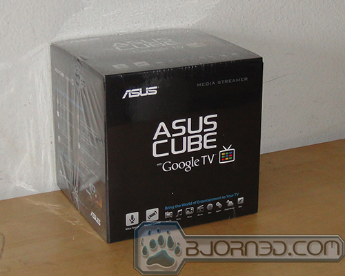
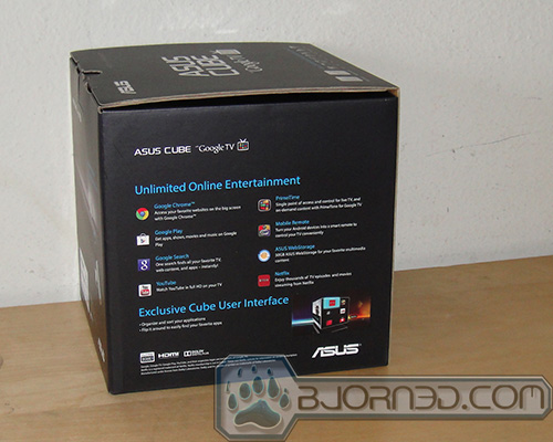
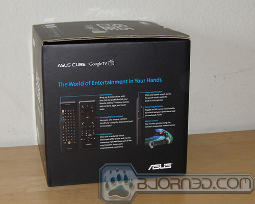
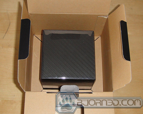
Retailed at $139.99, the Cube is shipped in a very attractive box that looks sort of like a cube. We have always like Asus’s package from our years of reviewing their products. On the Cube, the exterior cardboard box features plenty of marketing information describing the various features and an overview of the included.
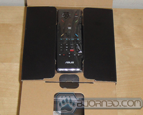
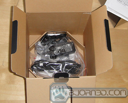
Inside, Asus pays special attention to how the unit is being protected during the shipping. We are first greeted with the unique remote (more on this later) sitting on the top of the box. Underneath is where the Cube is located with two pieces of cardboard cut-0ut box securing it during the shipping. The accessories are placed on a separate compartment on the bottom of the box.
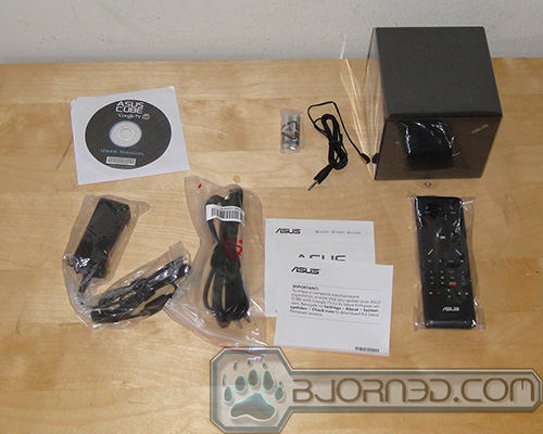
In addition to the Cube, we also get a power brick and the cable, a remote control with two AA batteries, IR blast cable, a Quick Start Guide, and User Manual (CD).
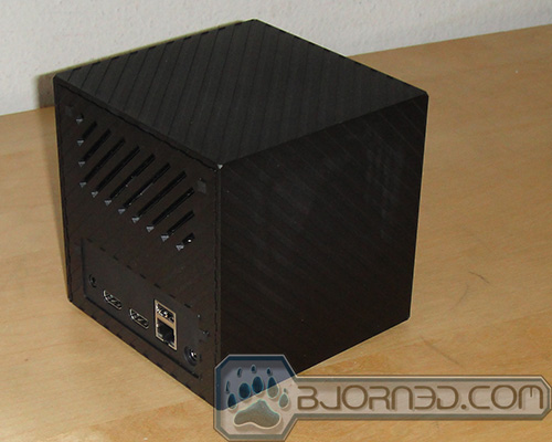
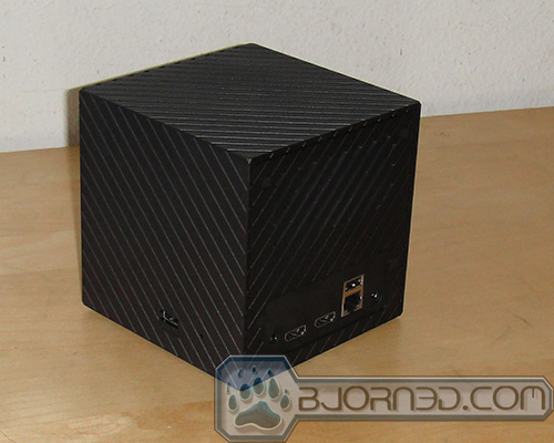
The unit measures just a tad under 5 inch on all sides is made with hard plastic with molded stripe cutting diagonally across each surface. It only comes with a single black color. On the front, we have a very tiny obscure Asus logo on the corner and right underneath it is the power LED indicator. The indicator lights up amber color when the unit is in standby and will lit up blue when it is on. The IR blaster is a nice touch as it can be used to control other devices. However, we were having issue getting it to control our Sharp HDTV. We tries all of the preset codes but none of them worked with out television.
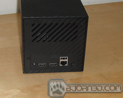
Moving to the side, we got a single USB 2.0 port and a tiny hole to reset the device on the left and nothing on the right. The rear of Cube features the IR blaster connector, an HDMI input, an HDMI output, an USB, an 10/100/Gigabits Base-T Ethernet port, and the power connector. If you are not a fan of cables, the device will happily connect to your wireless network with the internal wireless chip that is supports 802.11 b/g/n. Unfortunately, it will only connect at 2.4 GHz and not the 5.0 GHz.
The exterior of the Cube lacks any buttons. There is no power button as all control, including power on/off, is done via the included remote. It does feature a special trick through the HDMI port that supports HDMI CEC where it will automatically turn the TV on when the device is turned on. With the integrated HDMI input, the Cube can accept any device with an HDMI out such as cable or satellite set-top box. We did not test this feature since we do not have a cable or satellite service.
Internally, the Cube is powered by a dual-core 1.2 GHz Marvell Armada 1500 (MV88DE3100). This is the same SoC that is powering other Google TV devices. It also comes with 1GB of RAM and 4GB of internal storage but only 2GB are available to the user. Out of the 2GB available, 1.89 GB are free to the user to load Apps and such. The Cube will read files stores in USB flash drive, USB hard drive, FTP, DLNA, of course, online storage. Popular video and photo file formats are supported.
Remote
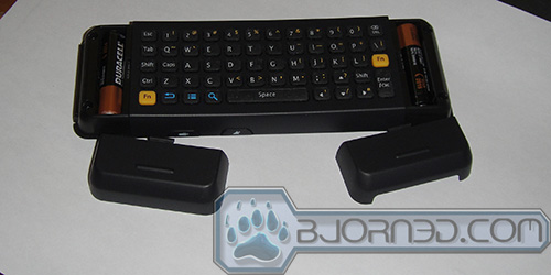
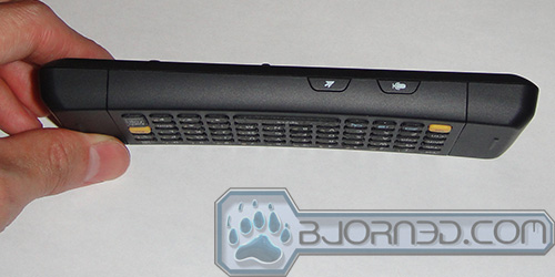
One of the most unique feature with the Cube is the included remote control that connects to the Cube via Bluetooth. The remote control included with the Cube is packed with features, functioning as a keyboard, trackpad, and media center remote. On one side of the remote is a 5 row full QWERTY keyboard. It also includes Android specific function button like back, search, and menu. There is a dedicated FN switch button on left and right side of the keyboard for easily switching to the special characters. It also comes with Tab, CAP, Shift, and Control button too. Typing on the small button is not the easiest task but this is expected. However, because the keys are all lined up in rows, it is easy to accidentally press the wrong key. The keys also feel a tad stiff. We also had issue where we sometimes would hit the trackpad while typing on the keyboard. Overall, we do not think that anyone would use the keyboard for typing long documents or replying to emails. For short inputs like searching files and media contents, and entering the web address, it gets the job done.
One area that Asus has done right with the remote is the placement of the battery. Unlike most media remote that has the battery placed on the bottom of the remote, Asus placed the two AAA batteries on either side of the remote. This helps to distribute the weight evenly throughout the remote, something that is important when using the keyboard as you would be holding it with both of your hands in order to type with the thumb. However, the layout of the keys leans toward the right slightly which means that our left hand has to stretch out slightly in order for us to type.
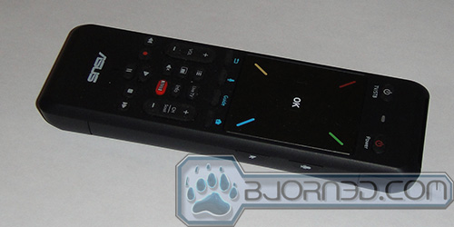
Flip the remote over and we get a large trackpad with a dedicated “OK” button in the center and four directional button. Right above the touchpad is the power button, TV/Standby button, and the battery indicator. Underneath it is where the media centric buttons are located. The trackpad provides navigating the graphical interface much easier than clicking through whole bunch of icons. In addition to the four directional pads, it also supports some basic gesture such as drag and drop (by long press the cursor toggle key while dragging icons) and two-finger pinch-and-zoom. The trackpad functionality can be turned on and off with the with the toggle button located on the side of the remote. When it is turned off, it functions as a directional keypad and the center of the trackpad serves as a select button (or the left click on the mouse). For the most part, the trackpad works just as it promised. We had no trouble navigating around with it, although the performance is not great it does get the job done. We did notice the spacing of the directional keys are a bit crammed.
Underneath the trackpad are four special buttons for the Home, TV Program, Voice Search, and Return. The Home returns to the main user interface, the Guide opens the TV Guide program, Voice Search activates the voice search function, and the Return is like the back key in Android that returns to the previous screen/open apps. Then we also get the typical channel scroll, volume up and down and the media playback. Additionally, there are special buttons for the Live TV, Information, Netflix, Mute, Picture-in-Picture, and Option. The dedicated Netflix button is a nice touch.
The right side of the remote has two dedicated buttons. One of them is to activate the voice search while the other one is to toggle between the touchpad and the D-pad. The buttons are slightly raised but their placement can get in the way if you hold the remote in your right hand. When holding the remote on the right hand, it is easy to accidentally hit these two buttons while using the trackpad.
The remote is packed with couple of special tricks. For one, it has a build in mic to support voice search. When pressing either of the two buttons located on the remote, you can activate Google’s own Voice Search functionality to search for digital contents stored on the device as well as online. In addition it also supports motion sensor so that you can play games with the remote.
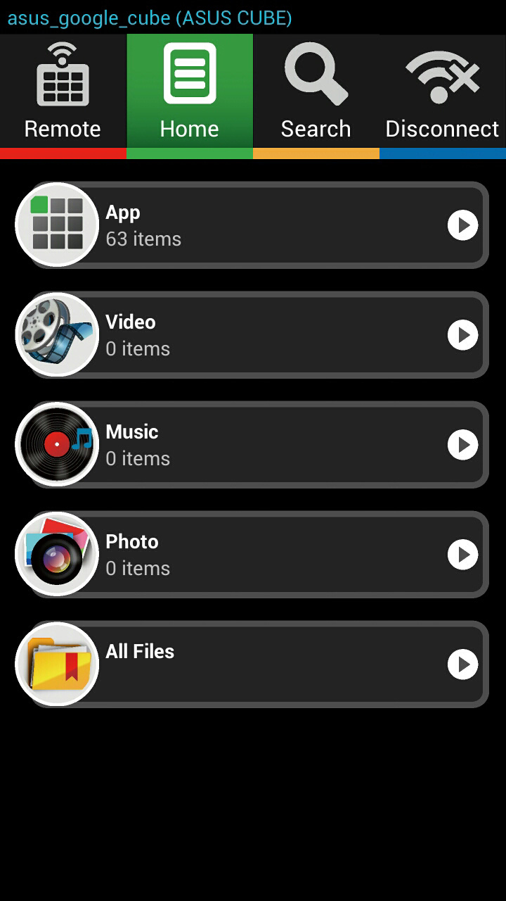
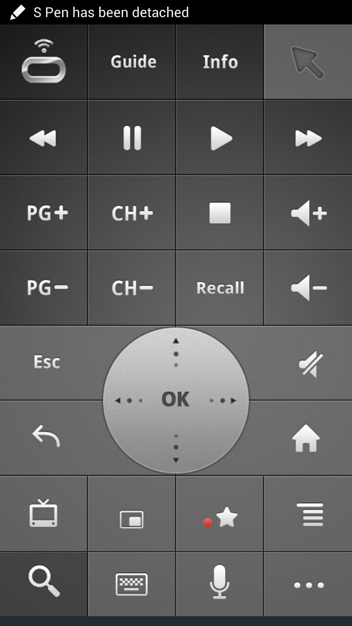
For those who don’t like the physical remote, you can always download the Asus’s own Mobile Remote App, which essentially combines the Google TV Remote with Asus’s own app.
User Interface
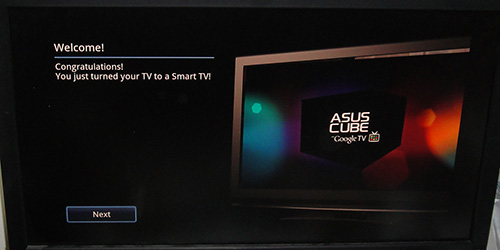
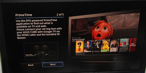
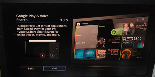
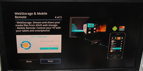
Upon starting the Cube, the device will walk through a quick guide highlights some unique features of the device that includes the remote control, Google Play Store and Asus’s WebStorage.
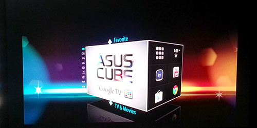
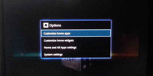
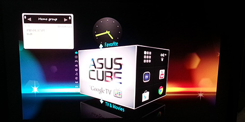
The Cube runs Google Android 3.2 with Asus’s own custom UI. Staying with the same theme, Asus’s UI mimics a cube viewed from a 45 degrees angle. On one face of the cube, we have navigational menus and the other face shows a preview of up to six selections submenus. The Menu is divided into Home, TV & Movies, Games, Social & Life, Sports, Music News, Education, Photo, and Favorites. The six preview icons can be customized by pressing the Option button on the remote.
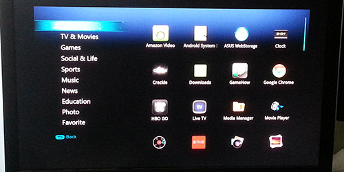
If you are not a fan of the Cube UI, you can always see the list of Apps and links by going to the All Apps submenu. Here is a more traditional Android look with a list of icons for each Apps and links. The left side contains the same Menu option as what we saw with the Cube UI and the right side is where we can see the list of Apps. Unlike the Cube UI, that limits six preset Apps, here we can have unlimited numbers of Apps. The idea is that users can put the commonly used Apps/links on the Cube UI that acts as the Launcher or home screens and then the All Apps is the Application folders. While the All Apps does not offer the ability to create folders, you can always organize the Apps in the categories provided. Unfortunately, the list of categories cannot be changed or renamed.
Asus breaks the included Apps and website links into categories. Below is the list on what Apps and linked are placed in each categories:
- TV & Movies: Amazon, Asus Webstorage, Netfix, and Movie Player
- Games: Game Stop, Games.com, Yahoo Game, GamersBin, 1000 web games, GamesForum
- Social & Life: Asu Webstorage, Media Manager, Whiteboard, Spotlight, BLUEFLY, Pinterest, Ticketmaster
- Spots: NBA, MLB, NHL, NASCAR, USOPEN, NFL
- Music: Music Player, TuneIn, Live365, Pandora
- News: BBC, ALJAZEERA, L.A. Times, USB today, N.Y. Times, U.S. News
- Education: National Geography, TED, Wiki, Discovery, MIT open course, Open culture
- Photo: Photo Gallery, Photos, Zoomer, Flicker, Picassa, Photobucket
Besides the Apps and bookmarks listed above, the Cube also comes with other Apps that includes Crackcle, GCII, Chrome, HBO GO, Live TV, Media Manager, Movie Payer, Music Player, Netflix, Photo Gallery, Photos, Play Movies and TV, Play Music, Play Store, PrimeTime, Search, Spotlight, Task Killer, White board, and YouTube. Of course many of these Apps can be downloaded directly from the Play Store and can be uninstalled. While other makers likes to include tons of in-house Apps with their device, Asus is generally one of the few companies that includes the least amount of bloatware. The included WebStorage Apps is useful, as users can get 50GB of free storage for 2 years after register the account. Also, the Whiteboard App another one of the Asus Apps, offering note taking functionality. The included Task killer is also useful to manage any background apps.
We are not a big fan of the design of the skin since we felt that there is a lot of wasted space. The unique cube looks good and the ability to preview 6 adjustable submenu is neat. However, there is just way much space left unused. Luckily switching between the menu and navigating the interface are quick and speedy. Opening Apps, however, is not as fast as what we would have liked probably due to the processor and 1GB of RAM. One thing we do wish to have is the ability to do infinite scrolling or a page scroll.
Generally speaking, navigating the Cube with the included remote is pretty easy. The need to switch between the D-pad and the trackpad is a bit annoying. We would like to see two finger scrolling supported as well so that we do not have to constantly switching between the D-pad and the trackpad mode while navigating through the list of Apps. Some UI elements like moving to the address bar or selecting a specific section in webs work better with the Trackpad while other UI elements like selecting Apps or scrolling in a web work better with D-pad. We found ourselves constantly switching between the two modes. In addition, some UI like the initial setup of Netflix would only work with the D-pad so there is some inconsistency here and there. Luckily the Android Apps works much better and it is much more enjoyable. We found that its is more enjoyable to navigate the UI with the Apps on our Galaxy Note II. The only problem is that the both the device and the phone have to be on the same wireless network for them to work together.
There are some inconsistencies with the UI especially between the Apps. For in the Amazon Instant Video, the Stop button does not stop the playback like it does with other program. In fact, it does not do anything at all except displaying the progress bar. In addition, despite some icon in the list of Apps like the HBO Go appears to be a dedicated App, in reality it is simply a link that launches launches the browser and load the HBO Go website.
Customization
One of the beauties of the Android system is the ability to customize the user interface via widgets. The Cube supports and comes with a few widgets. Though, its widget collection and customization is not a big as what we have seen with the latest Android OS. Unlike other Android devices, the Cube only has one screen and that is the Home screen. All of the widgets are placed on the Homescreen. With the Cube UI sitting in the middle of the home screen taking up majority of the space, it does not leave us much room for other widgets. You can probably place about 4 more widgets on the screen. Of course, we do not recommend putting much more widget than four either since it may take up too much of the RAM.
The list of Widget included is Clock, Music Player, Whiteboard, Google Play Music, and the Play Store. The widget sizes are not customizable like what we can do on our smartphones. Depending on the widget we found that sometimes the cube interface will block the widget. The ability re-seize the widget would be appreciated. Also, the widgets do not auto-rearrange like what we may have seen with the latest Android OS so trying to organize them is a bit challenging with the included remote.
In addition to the widget, users can also customize the Cube with different home screen background wallpaper that includes pictures, live wall paper, and regular wallpaper. Furthermore, Asus provides the tool to select which Apps to automatically start up when the unit is powered on. Also, the Cube has the ability to hide certain Applications from the list.
Performance, Usability
We have used other small form factor systems like the Zotac ZBox, Sapphire Mini Edge and the Arctic MC101 that are based on the x86 platform. In addition, we also have used dedicated media streamers like the HornetTek Phantom. Obviously, the ARM the processor found in the Cube is no match to the x86 processor like the Intel Atom or the AMD Brazo platform. However, for a simple media streamer, the ARM processor should be sufficient. The strength of Asus Cube clearly lies in its Google Ecosystem and the tight integration into the Google Play Store. Largely thanks to the success of Android in the mobile space, the Google Play Store has a wide variety of selection to choose from. The Cube is definitely better than other Media Player that lacks the Google integration. If you have your digital entertainment such as movies, TV shows, music, books, etc, in the Google Play Store account the Cube is a very nice device to have so that you can watch contents on your big screen TV. Not to mention that it also supports other third party streaming service like Netflix, Amazon Instant Video, Crackle, and HBO Go.
While the selection of Movie, TV Shows, and Music is great on the Play Store, we do feel that the App and Game selection is one area that Google really has to work on. We can overlook the Game selection because we do not feel that people would be playing much Game on their TV with the Cube (not until there is a better mean of interacting with the big screen) but we feel that the App selection needs to be improved. There are simply not enough Apps that supports the Google TV like it is on the phone and the Tablet. For example, a simple useful tool like Google Pinyin Input that allows us to input Chinese text is not available. We also tried to sideload some Apps but they failed to launch because it requires support for the portrait mode which the Cube/Google TV does not support.
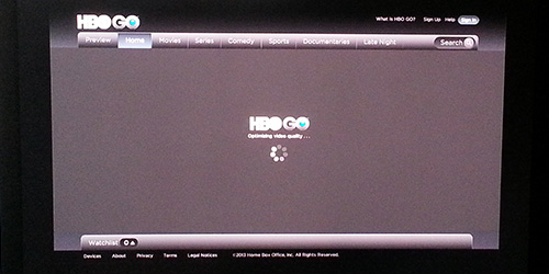
In addition to the mentioned UI inconsistency, we also felt that there are some minor bugs that still needs to be fixed. For example the HBO Go hangs at “optimized video quality” when we tried to play back a trailer.
The Cube also felt a bit under-powered. While navigating the main menu is quick and speedy, launching Apps can take longer than what we would have liked. In fact, it feels even slower than a two to three year old phone like the Samsung Galaxy Nexus. Sometimes when we press a button on the remote, we are not sure if the command was registered because the screen will appear to have frozen and we inadvertently will hit the key again, which will cause it to register twice. In addition, the device seemed to also slowed down when there were many applications opened.
Besides the Google integration, the Cube also stands apart from other cheaper media streaming device with its Chrome browser support. We do like the ability to browser websites, but since the Cube always loads the full desktop by default, loading sites can be rather slow. We feel that it would be better if Google can set it to load the mobile site as default like what we get on our mobile devices to speed up the performance. Given to how much under-power the CPU on the Cube compare to the quad core processors on the latest Android phones, it makes more sense to do so so that it can provide a more enjoyable experience.
Granted, not all these are Asus’s fault as it is a combination of the hardware and the software and the whole Google TV ecosystem. Issues such as UI responsiveness and performance optimization are something that Google still need to work on and we hope that the upcoming 4.2 OS upgrade that Google has announced at this year’s IO will fix many of the issues. We do not know if the Cube will get the update to the latest Android but given to Asus’s track record, we think we should see it pretty soon once Google has launched.
Conclusion
From the design point of view, the Cube is a great little box that can be used to augment your digital media entertainment. The Cube is small enough to be tucked into a corner and it does what it does well. The unit is certainly more powerful than a simple media streamer but it is not as powerful and complex as a media PC. What it is designed for is for those who want the “Smart TV” without buying a new TV or going through the trouble of setting up a Media Center PC. Unfortunately, its performance still needs improvement and the usability and navigation sometimes can feel complicated and confusing for those who just need a simple device. Most people who are looking for a media streamer to hook up to their big screen TV are simply want a device that is easy to use with a simple UI.
What makes the Cube stands out is the included remote. While it is not perfect, it does bring some neat functionality such as Voice Search that makes it unique and useful. It is decent enough to navigate the UI and provides good text input. We were especially satisfied with the Android App that Asus has included. Ultimately, if all of your digital content is in the Cloud, specifically Google driven, then the $139 Cube is a nice addition if all you need is TV streaming ability. Google still has some major work to do on Google TV if they want to enjoy the same commercial success as Android did on smartphones. Having the support for the Android Apps and the Chrome browser is great but at the moment we feel the App selection still needs major push from Google. It is something that we are hoping Google will address in the upcoming OS release.
| OUR VERDICT: ASUS Cube | ||||||||||||||||||
|
||||||||||||||||||
| Summary: The Cube is a nice device to have if you want to stream content to your TV. If your digital content media is all in the Cloud, especially in Google’s ecosystem, it will get the job done. Despite some issues we may have with the device, it is probably one of the best Google TV device out there and we hope that future software update will fix some of the issues we have experienced. |
 Bjorn3D.com Bjorn3d.com – Satisfying Your Daily Tech Cravings Since 1996











why is the article in 2 different size fonts?
thanks for the info. We have fixed some odd codes that got added into the review. It should be fixed now.